
U.S. Ecommerce
Homepage Refresh
A focused U.S. ecommerce refresh ahead of a broader rebrand, supported by competitive research, UX recommendations and Figma preparation for development.

The challenge
LOWA needed to improve its U.S. Shopify Plus homepage without investing in a complete redesign ahead of a larger brand overhaul. The project had a firm September deadline and a limited budget.
The existing homepage relied on lifestyle imagery and promotional tiles linking to individual boots. The opportunity was to create clearer ways into the assortment, particularly for visitors unfamiliar with the brand, while strengthening the page’s search foundations.
Research into a
build-ready file.
LOWA’s team developed the visual concept. I contributed competitive research, shopping-path recommendations, and a search and AI-visibility audit, then translated the team’s HTML mockup into desktop and mobile Figma files for the developers.
Define shopping paths
Through kickoff questions and a review of about twelve competitor homepages, I recommended shopping by activity, fit needs, new arrivals and product collections.
Improve findability
My audit found that AI answers already ranked LOWA first for durability and ankle support. I recommended clearer headings, metadata and structured data so search engines and AI tools could find that strength on LOWA’s own site.
Make it buildable
Using Claude and the Figma MCP, I prepared desktop and mobile layouts and reviewed typography, responsive behavior, product imagery, links and Shopify-driven content. I also flagged mismatches between visuals and shopping labels, including backpacking imagery paired with hiking calls to action. LOWA’s team discussed the feedback with me and revised imagery and other details.
Selected desktop layout and mobile decisions
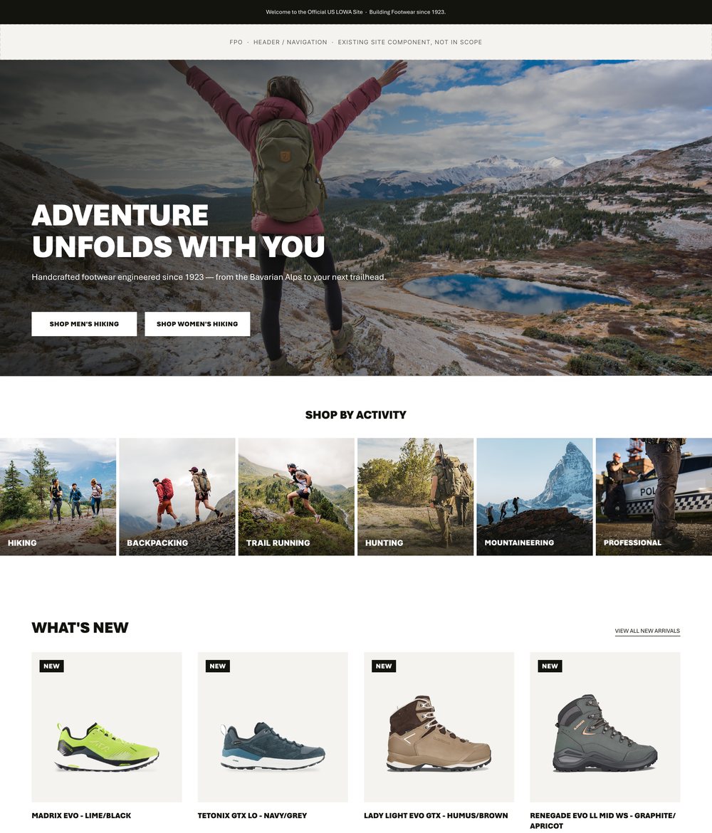
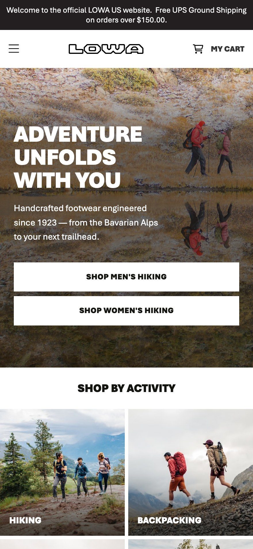
Desktop layout prepared from LOWA’s supplied concept. On desktop, the live hero rotates through several photos; phones show one.

Solid white CTAs
Recommended buttons that remain readable across changing hero photography.

Swipeable product rows
Explored stacked and swipeable layouts. LOWA chose swipe rows for new arrivals and collections.

Labels with a purpose
SHOE FINDER and FIND MY FIT tell shoppers what to expect.
Four ways into the assortment, where there was one.
- Shop by activity
- Shop by need
- New arrivals
- Collections

From promotions
to product discovery.
The earlier page led from large lifestyle and product tiles to individual products. The refreshed structure offered multiple entry points: activity, waterproof or wide-fit needs, new arrivals and product collections. Visitors could browse relevant options before deciding on a specific boot.
From individual product promotions to broader shopping paths.

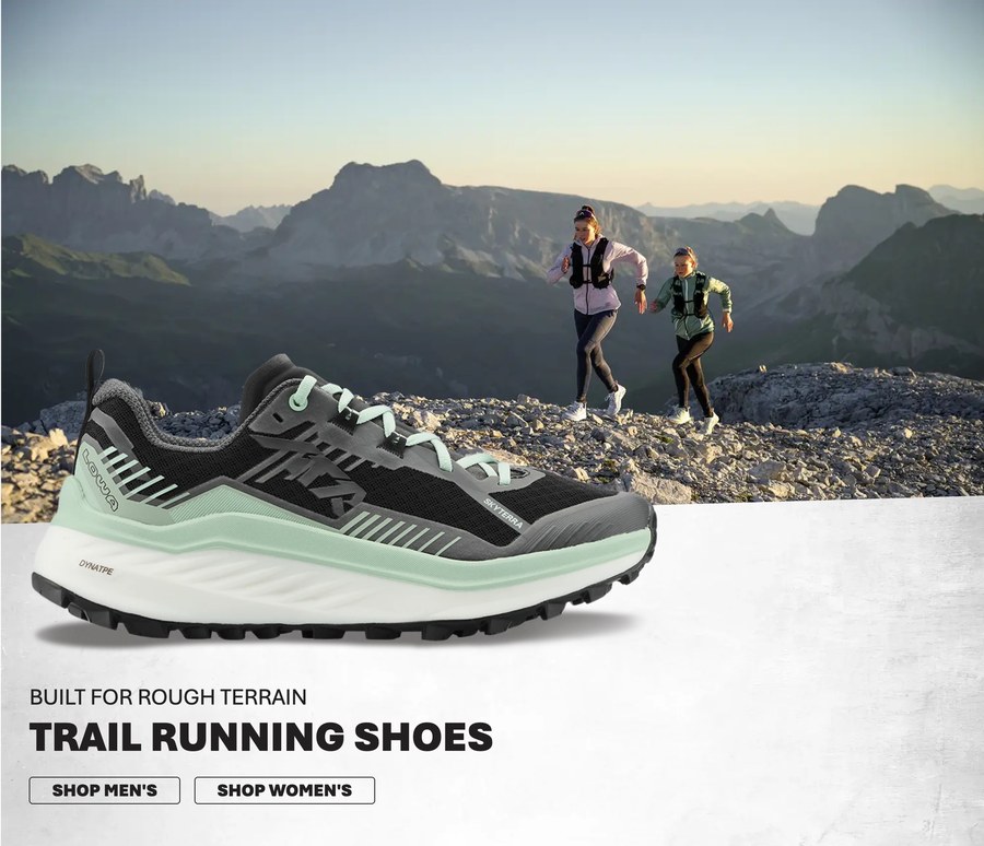
Large campaign imagery promoted specific footwear models and colorways.
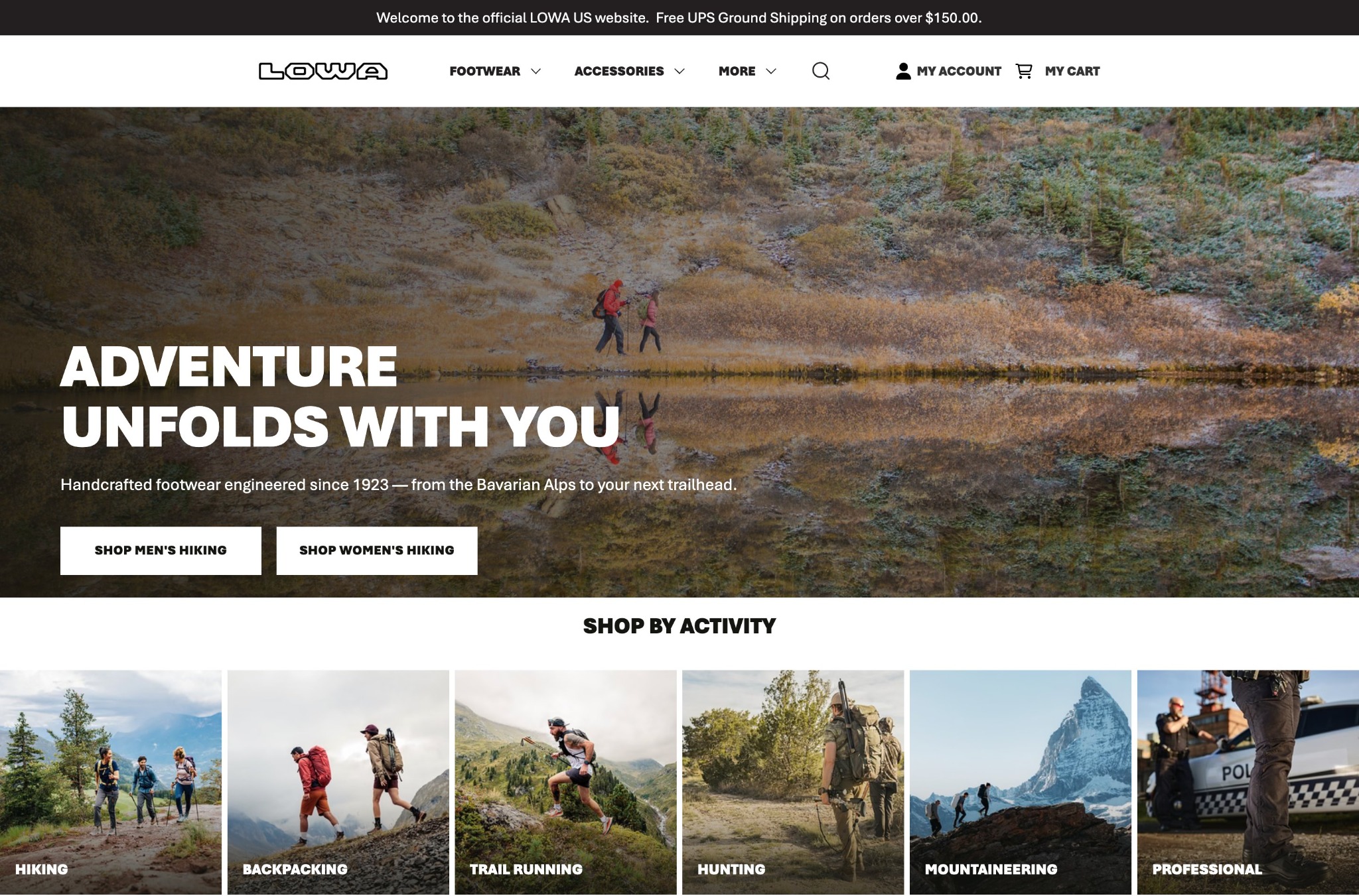
Activity categories move directly below the hero, with more paths through the assortment farther down the page.
My handoff addressed the details that affect how a design behaves once it reaches Shopify: available font weights, product images served on white, clearer CTA labels, and which sections pull products from the store. On desktop, the hero crossfades between photos, without the flash of background in the supplied code; phones get one still image.
I also recommended accessible heading structure, keyboard focus states, carousel behavior and badge contrast improvements. And I started a small brand system in Figma with Claude and the Figma MCP, drawn from what LOWA’s German and U.S. sites already used, ahead of the upcoming brand change.
A timely launch.
Clearer shopping paths.
The page launched within budget for September. In the first five weeks, checkouts from sessions that began on the homepage increased 44% while homepage visits were about 10% lower. Desktop clicks per homepage view increased approximately 28%. On phones, “Shop Men’s Hiking,” one of the solid white hero buttons from my file, became the second most-tapped element.
The release also included an H1, a page description and headings for each section. The work reinforced the importance of designing for the actual storefront, from loaded fonts and product photography to responsive behavior and live merchandising data.
Five-week observed results from LOWA’s analysis; not an attribution of store-wide sales or a causal claim about the refresh alone.
Also for LOWA: At LOWA’s request, I tested AI image-to-video tools (Higgsfield, Kling, Seedance, Magnific and DomoAI) for 360° product rotations, as a lower-cost alternative to a studio shoot for product pages and social. The U.S. team reviewed them closely against the real boot and sent a couple to headquarters in Germany for review.